
Website Redesign
Redesigning an existing website for the Indiana Buddhist Center (IBC).
Background
The Indiana Buddhist Center (IBC) is dedicated to implementing the teachings of His Holiness The Dali Lama. The goal of this project was to redesign the IBC’s website to better communicate with the new and existing members.
Problem
The IBC board wanted a website that had a more modern feel that would cater to returning and new users while also promoting their upcoming events. Since their last website was made a couple of decades ago, they needed the website to be responsive too.
Solution
Design a website that has easy navigation.
Create designs that are responsive for many different devices.
Make sure the website can perform necessary tasks, i.e. collect donations, register for classes, promote events, etc.
Overview
Project: Redesigning an existing website
Role: Product designer (UX/UI)
Timeline: 4 weeks - 80 hours
Tools used: Figma, Maze
Empathize
Research Approach
My first step was to find the most important functions the website must perform. Once I knew that, I could investigate how well the current website performs those tasks and how it could be improved.
User Interviews
4 people were interviewed total via Google Meet. 3 of them were IBC board members and 1 was a developer. I wanted to gather board member’s thoughts on what were the most important aspects of the website to them while also taking into consideration the needs of the person who would be coding the website.
From all the interviews, I learned the top 5 needs were:
Heuristics Analysis
I focused on observing the usability and visual characteristics of the site. After evaluating over 100 points, I found 3 main points for improvement.
Competitive Analysis
After interviewing the board members, they gave me several sites that they found to be easy-to-use and would be great to model their new website off of. I chose 3 of those websites to include in the competitive analysis.
fpmt.org 2. tnlsf.org 3. lhagsam.org
Although the sites were more updated than the IBC site, I saw positives and negatives about all three sites in the analysis.
Define
Pain Points
Based on the research, there were 3 main pain points that needed to be addressed in the redesign.
Establishing consistent formatting and UI.
Creating a guide for new users/visitors.
Ensuring the site is responsive for different devices.
Problem Statements
How might we create a responsive IBC website that is a souce of information for all users, new and returning?
How might we easily communicate which events are for beginners or advanced members?
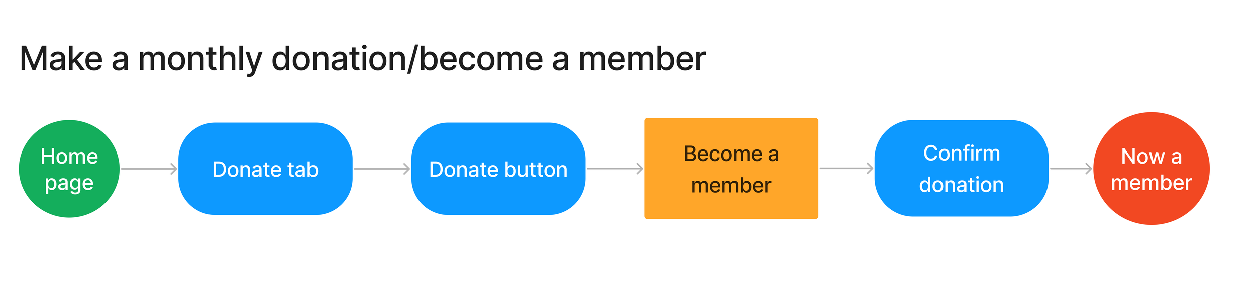
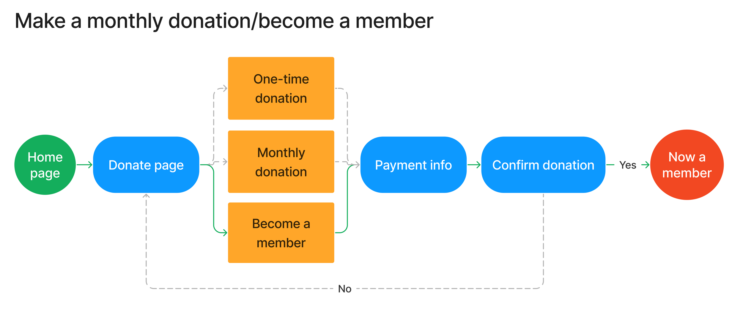
How might we make monthly donations?
Personas
Persona 1:
Sandra is an organized, busy professional who likes to plan in advance. Having reminders and automatic withdraws for her monthly donation help her balance her professional and social lives.
Persona 2:
May is a student with an unpredictable schedule. She needs easy-to-read information so she can make a quick decision whether to attend an event or not.
Ideate
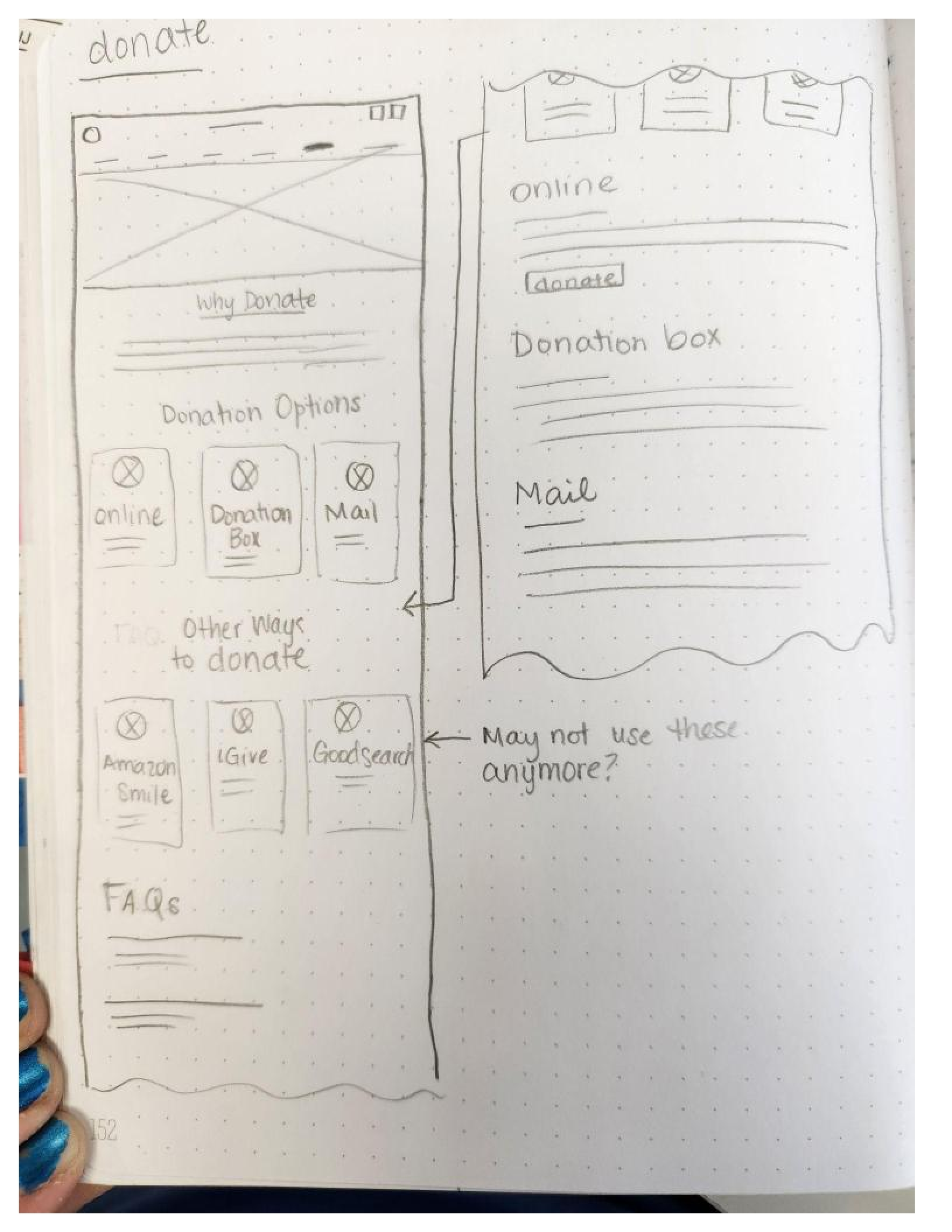
Site Map
Based on the organization of the current site, I made a site map that logically rearranged and eliminated content. The main tasks users needed to evaluate were, make a donation, register for a class, and view the page for new users.
User & Task Flows
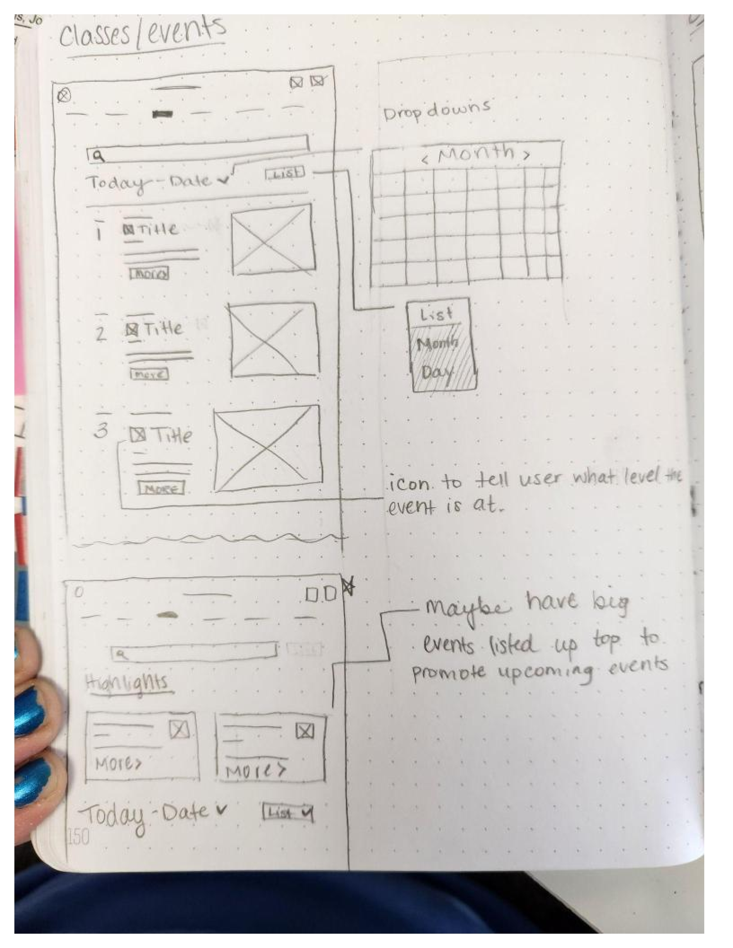
Sketches & Mid-fi Frames
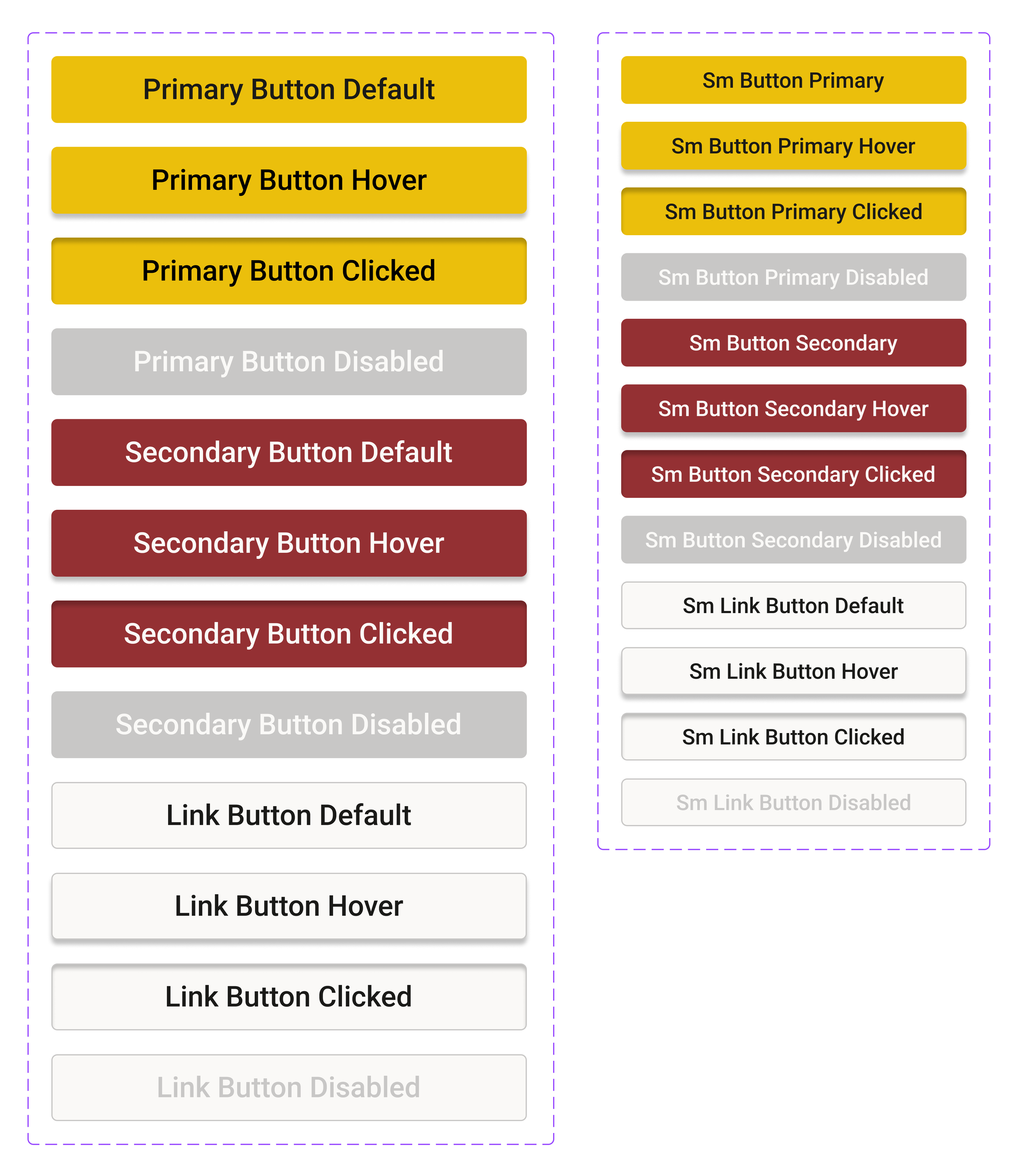
Branding & UI Kit
Design
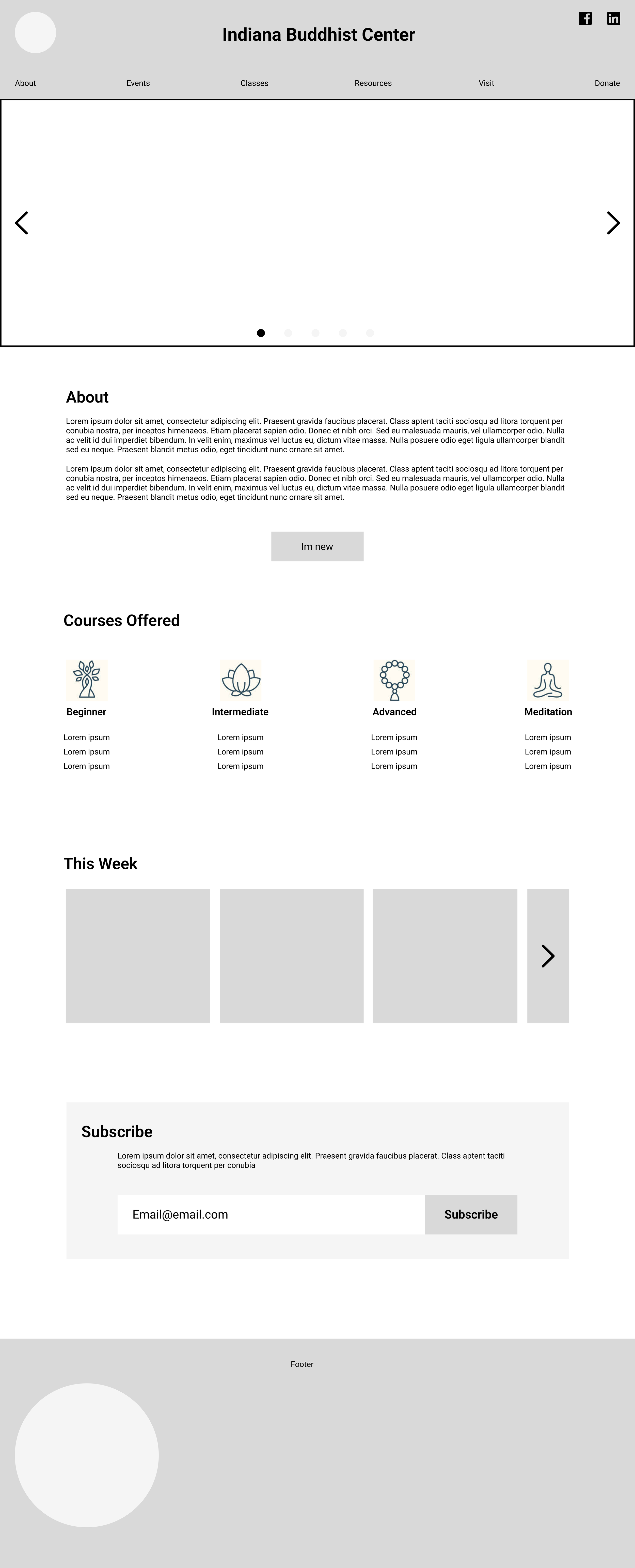
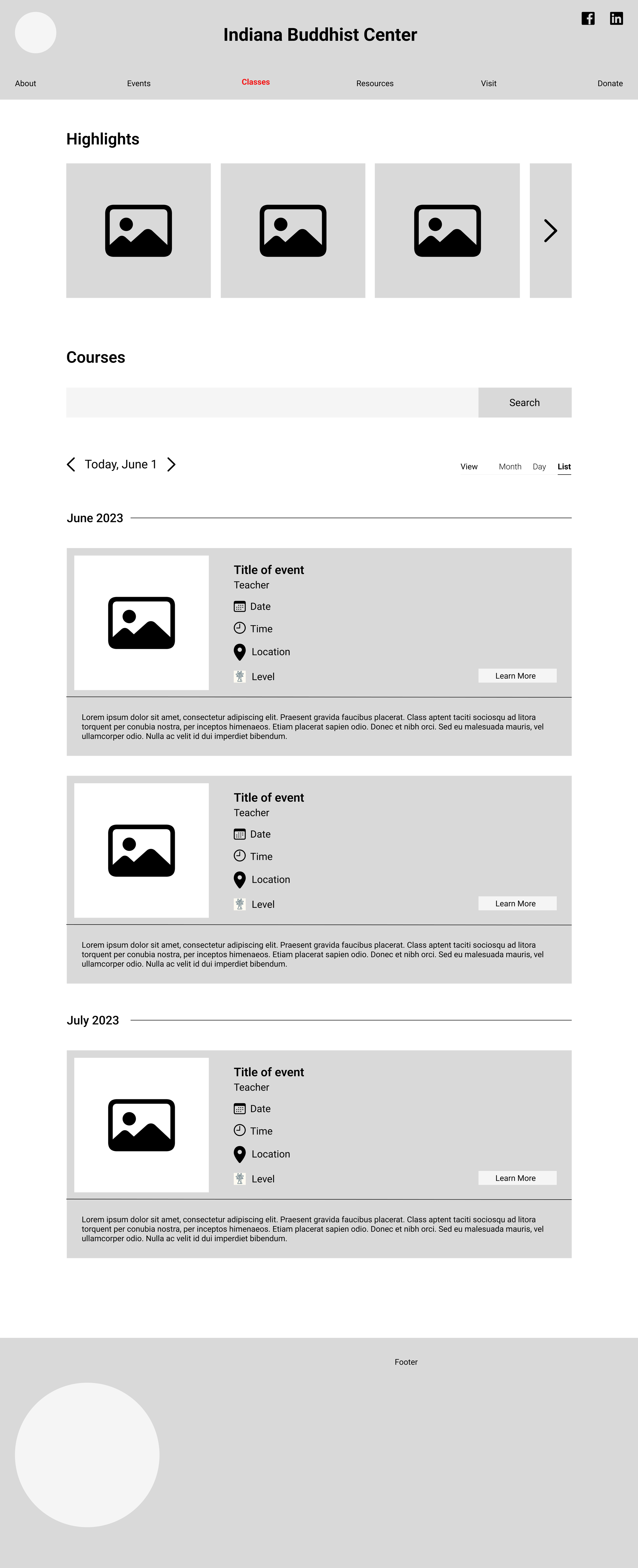
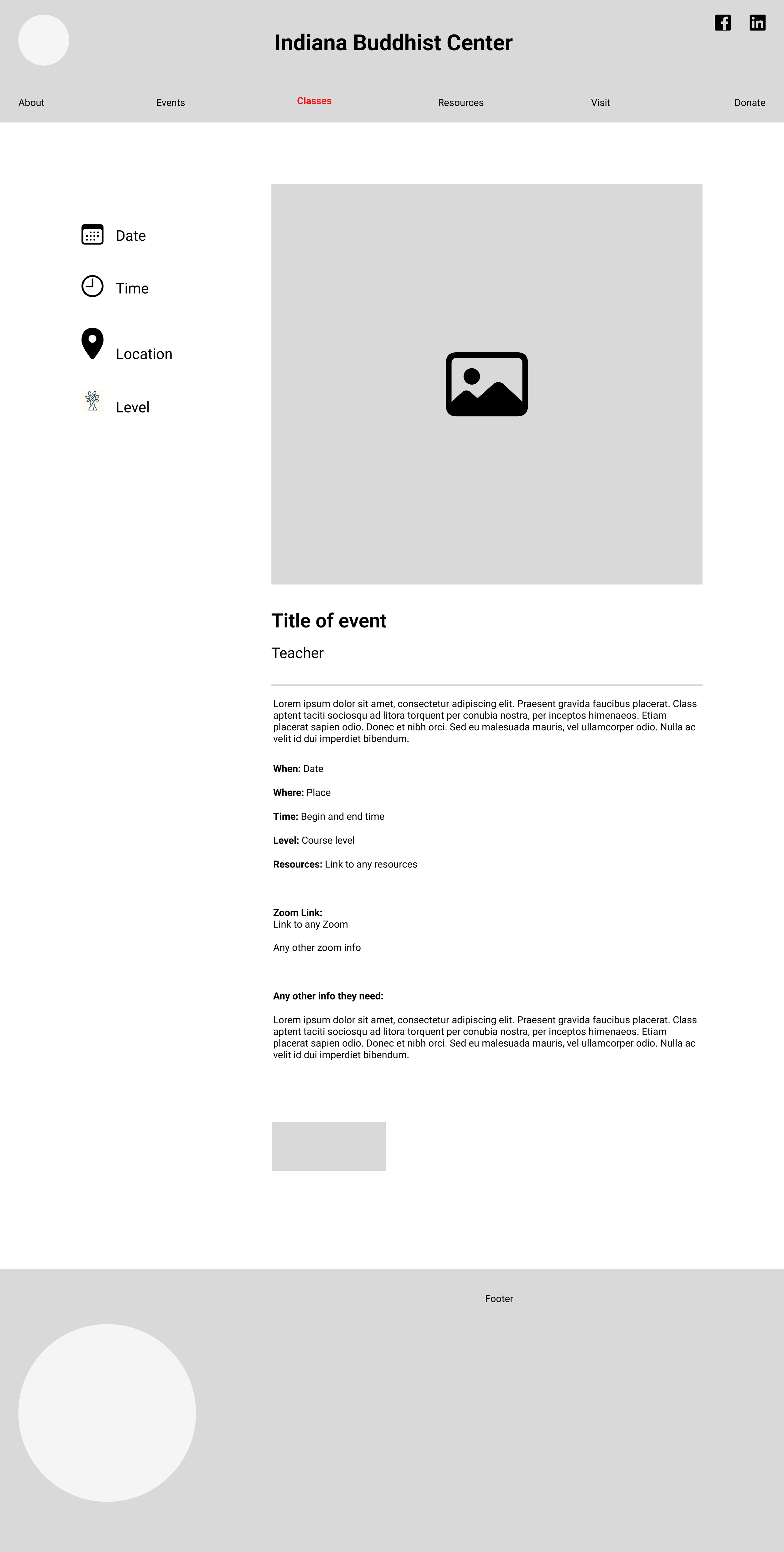
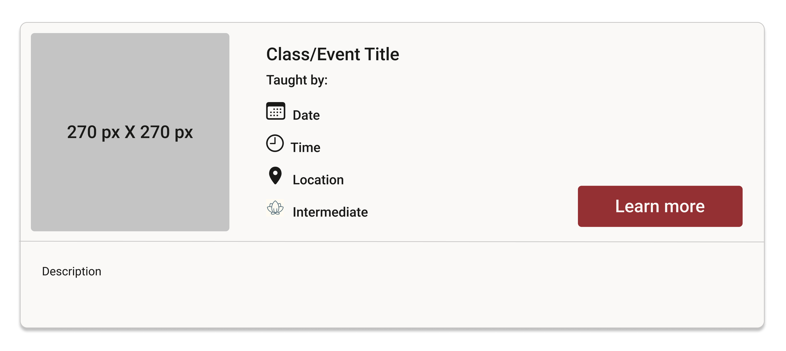
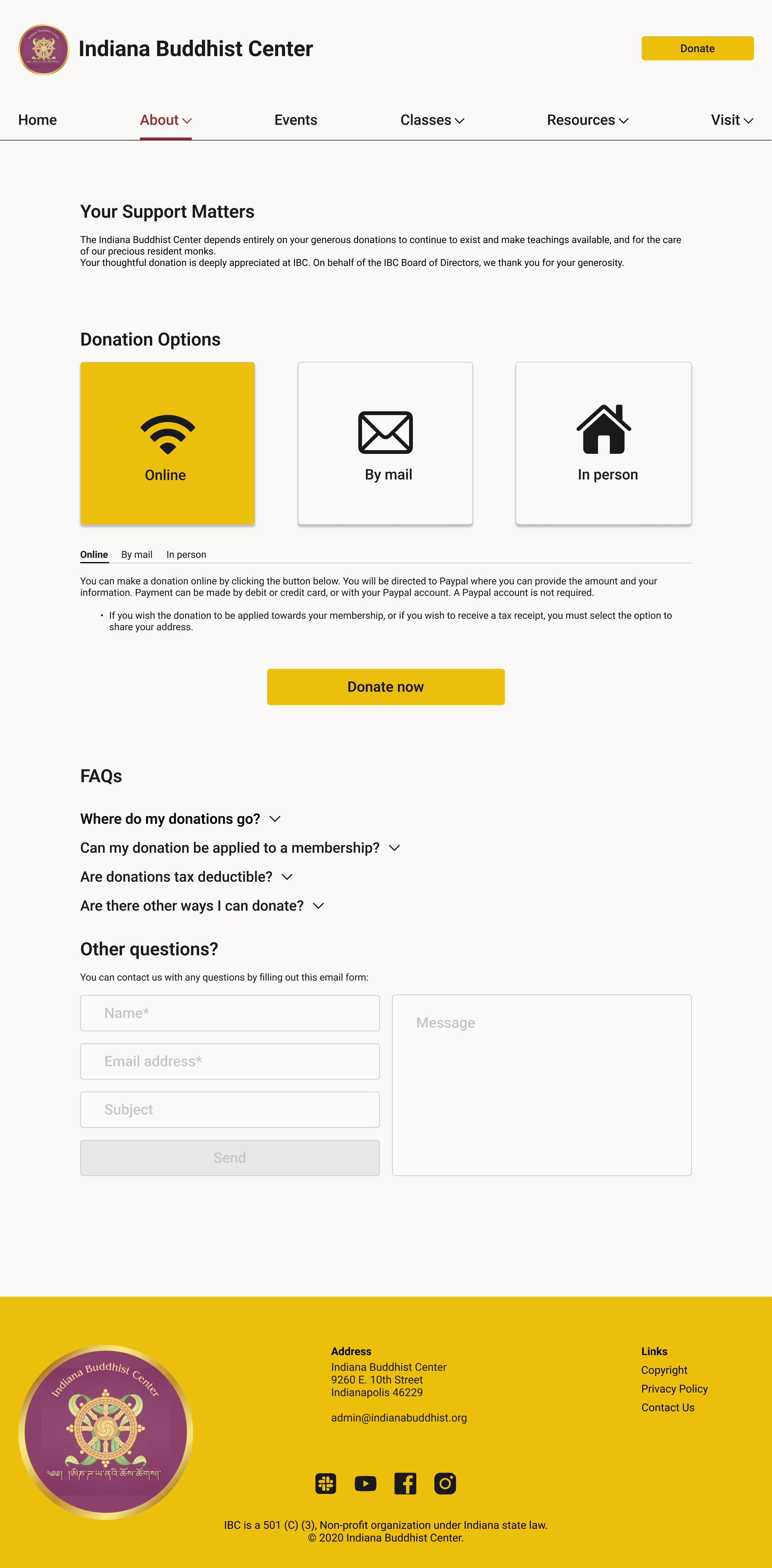
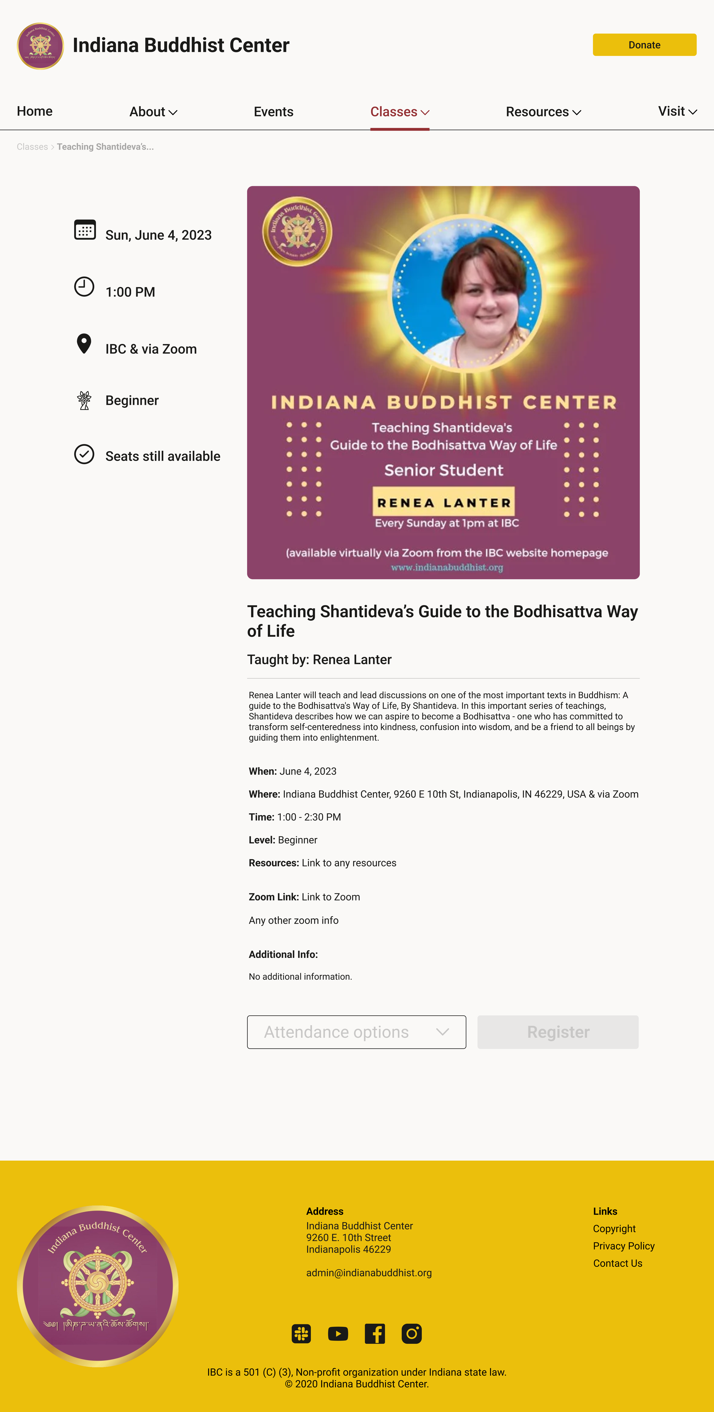
Hi-Fidelity Frames
Testing
Prototype
The screens were then prototyped and made clickable. If you would like to interact with the prototype, you can click here.
Navigation Before
Usability Testing
All 5 IBC board members were tested through Maze. They were asked to complete the three main flows, register for a class, view the donation page, and find the first-time user’s page.
Results
All tasks were completed with 100% success.
The testers found it easy to use with clear navigation.
One board member suggested making the donate CTA more prominent.
I still knew I needed to make the site responsive.
Iterations
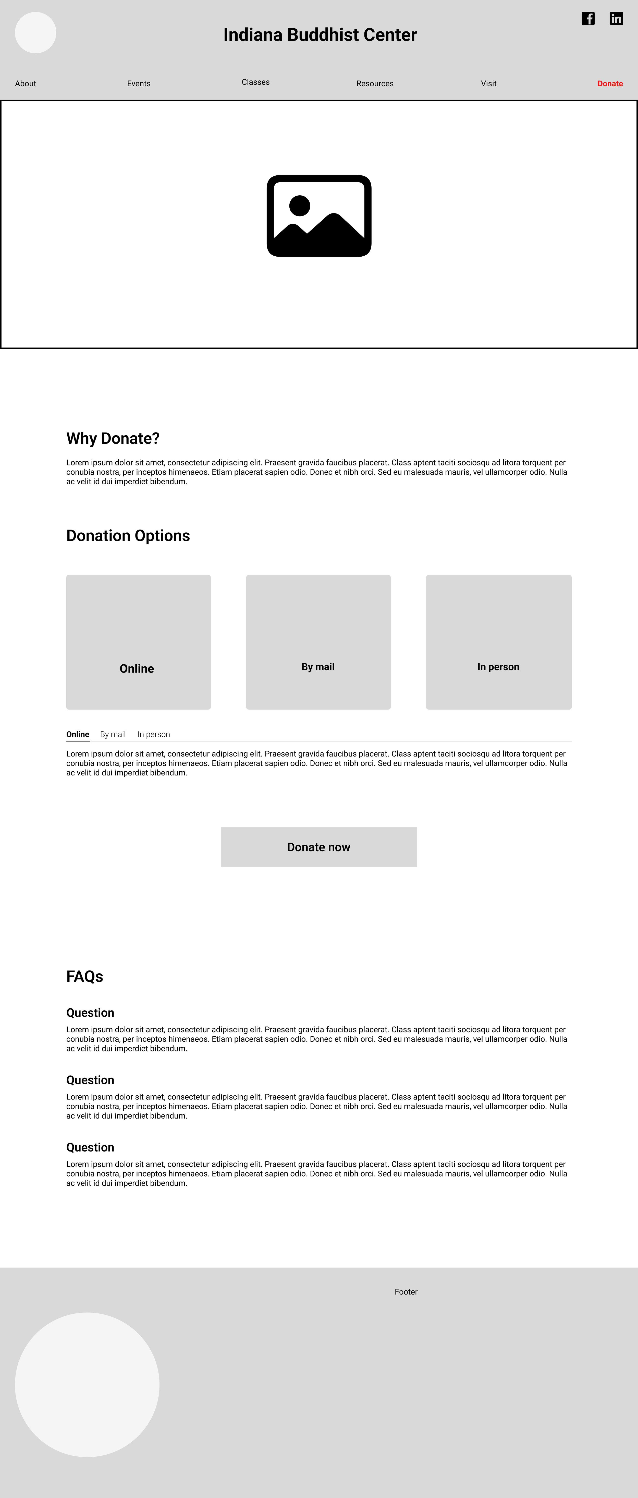
Most of the iterations I made were to the navigation bar. I added a home button and made “donate” a constant CTA in the upper right of the navigation bar.
Navigation After
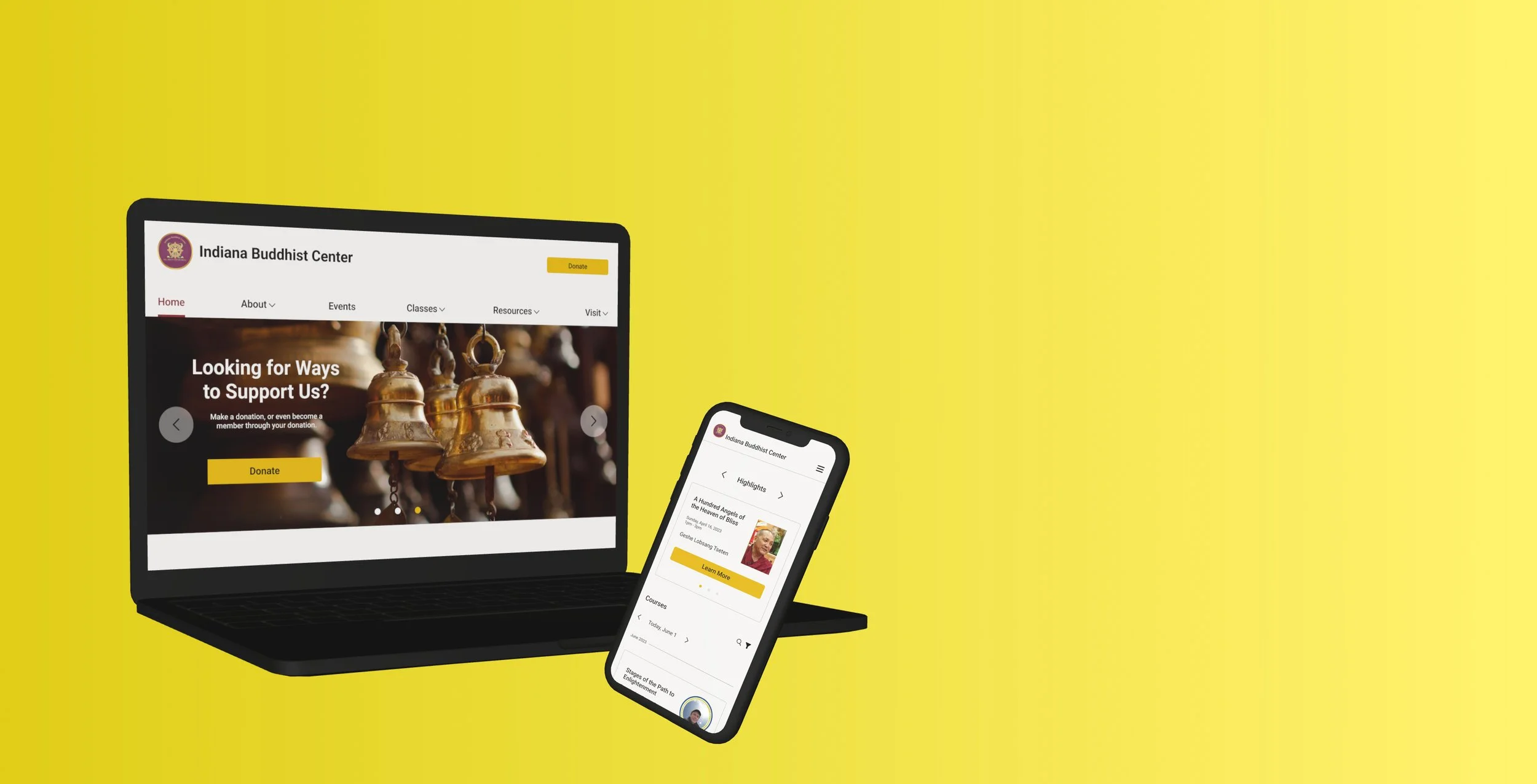
A “donate” hero image was also created for the home page to increase the likelihood for donations from site visitors.
The last thing added was the responsive screens. It is more likely that users will visit the mobile version more than the desktop version. To view the desktop and mobile prototypes click the button below.
Reflection
What I Learned
A lot of my time was used learning about making the screens responsive in Figma. I learned a lot about auto layout and constraints.
I found that the members would benefit from having templates for their future pages. This could just be a guide to keep the consistency throughout the page. I created a few templates they could use if they wanted to.
Desktop Templates
Mobile Templates
Next Steps
I will hand off the files to the IBC board members so they can develop the site.
If board members have any questions or want to make any changes I am willing to work with them so they are satisfied with their new site design.
Hopefully the site redesign will draw in more users so the IBC can be a hub for places that do not have access to reliable Buddhist teachers, classes, or events.